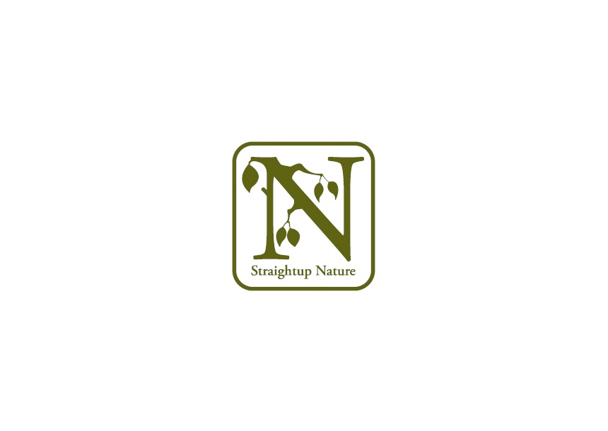
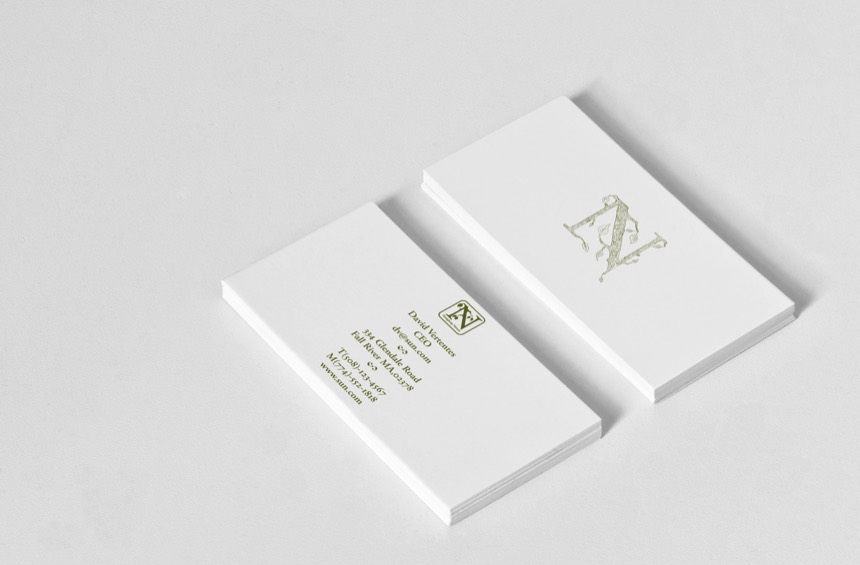
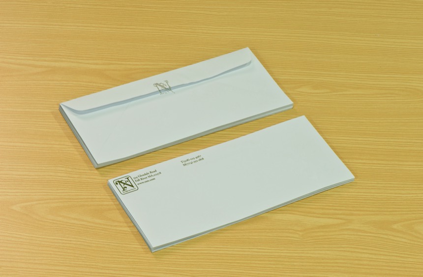
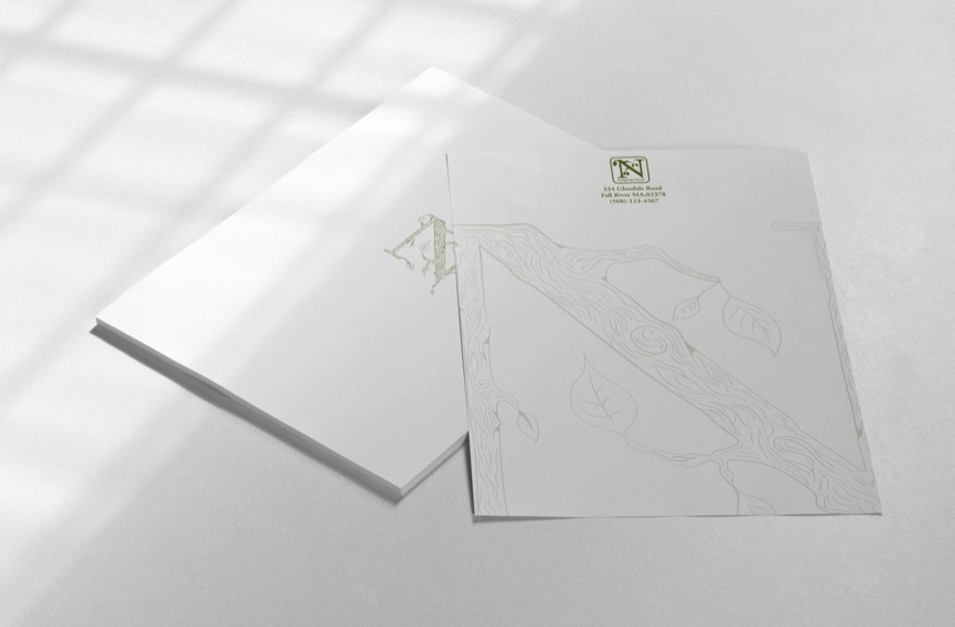
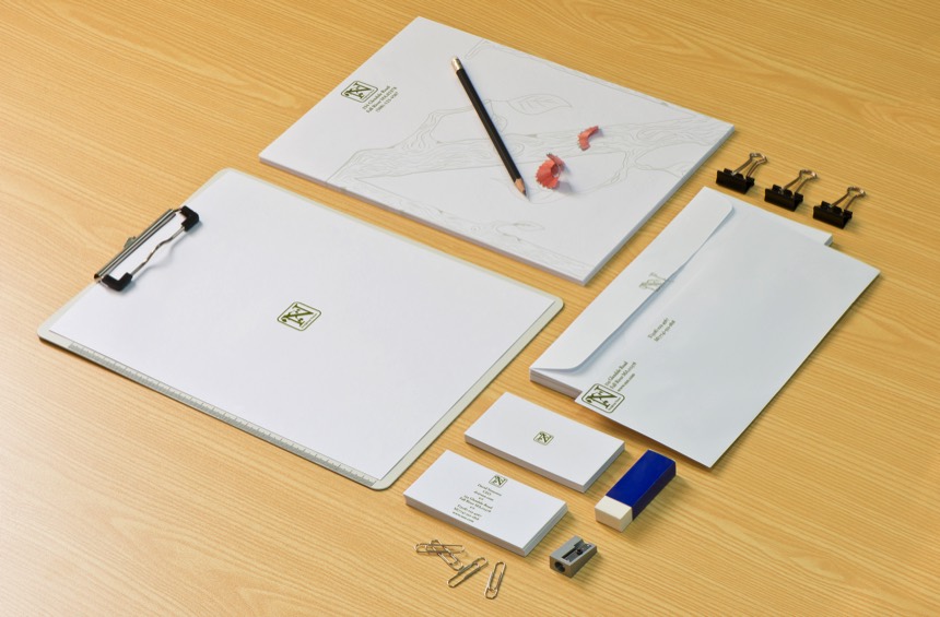
My first project from David was the logo for his all natural lotions and personal products company called Straightup Nature. The name was very urban but David did not want the look to be urban in any way what so ever. Propper with swag is what he called it. To make this happen I needed a classical font serif N which I found in my favorite type family Garamond. It also needed a natural look so I created branches and leaves, simplified the drawing with a silhouette with a curved square to surround the logo and voila the Straightup Nature logo was complete. David loves the logo and uses it to this day.
